SWAG is a digital creative shop. born to change the typical agency relationship, we become your partner because we understand that your success is our success.
we focus on designing and developing web and user experiences for all screens and devices. our digital toolbox is pretty big, from brand identity to search marketing, we’ve got you covered.
we are energetic, passionate, driven & love what we do. we build beautiful stuff for amazing brands,
what can we do for you?
Aragon Advertising is a full service digital performance marketing agency with deep roots in lead generation, B2C product sales, digital product downloads, mobile app promotion and call generation. In early 2012, when Aragon consisted of just the two founding partners, they approached SWAG to help “spruce” up their website. We “spruced” the hell out of it and shortly after that found ourselves performing a full rebrand with a new logo, business cards and brand design assets. Since then we’ve been asked to use every tool in the box, we have designed countless conversion landers, pay per call mobile sites, banner ads, brochures, presentations, trade show banners, we’ve built and maintained private cloud servers, tapped into hundreds of api’s, developed proprietary tech, built lead conversion generators and produced more business cards then any of us would of imagined (15+ employees and counting - Jan ’16).
Aragon Advertising is growing rapidly, because of a smart team with visionary leaders, but we'd like to think an awesome partner that handles all their creative design and development needs certainly hasn’t hurt.
SWAG Media Factory has been an integral part of Aragon’s growth the past 3 years by providing everything we’ve needed on the creative and development front. Our advertisers are looking for highly targeted customers to engage with their ad campaigns, and the unique website designs and conversion funnels built by Jake and his team have allowed us to deliver on those goals time and time again. Look no further for original, compelling work that is returned to you fast.Todd Stearn, Co-Founder and Director of Distribution
After working with some talented developers out of Seattle on several other projects, we were honored when they asked us to work along side them on their latest endeavor, the stealth startup Mylio, a photo management tool like no other. With a ton of tech and photography industry heavy weights on the board and invested in the product, and a super talented group of marketeers, engineers and designers, we were tasked with brining the UI/UX team’s vision and designs for the site to life on the web. It was a truly collaborative experience where the SWAG team was deeply involved with internal teams at Mylio. Mylio's biggest emphasis was for pixel-to-pixel precision, and that is why they came to us. The site was built with extreme care for all device sizes, with a truly responsive design that was consistent amongst the different viewpoints, but equally customized for each device.
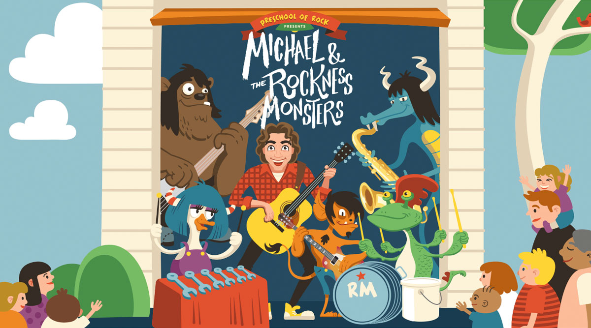
When we were approached by Michael Napolitano from Preschool of Rock to produce the website for his kids band 'Michael and the Rockiness Monsters’ debut album, we inadvertently shouted “YES!” at the top of our lungs...forgetting we were in a meeting and not at one of his concerts. Michael flung the monster filled debut album in our lap and said, I need this done in a week. They had press planned to go out within days of our meeting, they had a single dropping and a music video a week later. MATRNM is an energetic, rocking fun sound that is not just for kids, but also for kids at heart, and working on their site was equally exciting. We designed the site from the custom monster artwork that adorned the album cover, used Wordpress to power the backend CMS and developed a custom responsive theme with all the bells and whistles (and guitars and drum kits). We made the deadline without compromising quality and now we are just waiting for our anthem to be written, or at least we think we heard them say that.
StorageBlue’s mission is to redefine the storage industry, but that mission came to an abrupt pause when development on their site stalled. Their site was built across two different servers and was using both PHP and ASP (which is not a great mix), it needed to integrate with their POS software and it was imperative that everything worked nicely on mobile, as that was the majority of site visits. When SWAG was introduced to StorageBlue, we jumped right behind the wheel and steered this project in the right POS functionality and redesigned the interface to improve usability and optimize the user experience for mobile.
Shortly after we brought the site live again, the CEO at StorageBlue asked us to take over another site his previous developers were working on. The On-Demand Self Storage service, StorageBlue Now. This site was infinitely more complicated as we were dealing with e-commerce, subscriptions, customer management, driver and logistics management and another server migration. We were up to the challenge and after several months of usability testing, design and development we launched the product.
Today we continue to help StorageBlue push their mission forward and create a better customer experience to help redefine the storage industry.
SWAG Built this House
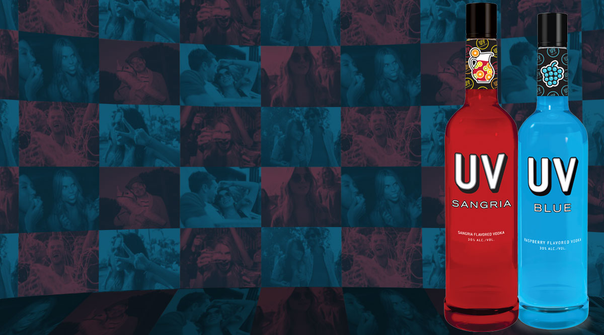
When leadership at New York’s Havas Formula PR Agency were looking for a development shop to help their client, UV Vodka, develop a rich social experience they coined “House of UV”, they looked to SWAG. The app was to create, collect and curate social media content for their grassroots taste testing events across the nation. With a short deadline of 6 weeks, we were asked to develop a Facebook app that integrated with instagram and twitter api’s that collected social posts utilizing hashtags from their events. Built on a scalable AWS server, we managed to get the app built, tested, approved and live in 5 weeks. To date the app has thousands of submissions, and 10’s of thousands of views of the curated content. We’ll drink to that!
Back in 2013, SWAG took up offices in Hoboken, when trying to discover the town we stumbled on HobokenGirl.com, a little blog with a very hefty following. When Jen (founder) moved to Hoboken she notice a lack of female voice and perspective online. No one was talking about the things that mattered to her. With a love of writing, she decided to start a blog to jot down her adventures in the mile square city-HobokenGirl.com was born.
When we stumbled on the site, it was still rocking the default 'Twenty Eleven' Theme. Needless to say, we couldn’t have something so widely read be incased in such a nonchalant way. So we pitched HobokenGirl.com on taking her hobby to the next level. We performed a full branding exercise and developed mood boards, brand colors, logos and design assets. We then began development on the site and built a functionality rich, minimalistic designed theme that took all the elements that people loved about HG.com the content, and made it central to the design. We also added analytics, more social interaction and monetized the site with many prominent ad spaces.
Once the site new site was live, we developed a media kit with price guides, impressions and ad buy packages that allowed the site to easily and consistently sell ad space. HG.com has continued to grow its audience with all major analytic statistics growing month-over-month. HG.com now has over 15 contributors and Jen is quite the Hoboken celebrity (although she would never admit it). She is invited by countless businesses to write reviews, she is asked to judge local competitions and she has become the go to source for fresh Hobokenites for all that is happening in town. We are fortunate enough to continue work with such a beloved woman and site, and we are certain Jen feels the same way (she has sent plenty of clients our way).